Light Bulb Web Design Blog
What actually is a website page?
If you look at our website design prices, and often those of many other web design companies, they talk about how many pages each price allows for.
But often we are asked "What do you mean by a website page?"
We normally define a website page as a specific part of your website that can be accessed by clicking a link in the main top menu - our standard web design price currently includes the following pages, each with a top menu link or for the Privacy Policy, a link in the footer (bottom of each page):
- Home page
- Services or About Us page
- Privacy Policy page
- Dedicated Contact page
Each of these 'pages' is seperate, they contain only information specific to that section of your website. We would normally use the Home page to focus visitors quickly to see what your business offers and why they should choose you, offering quick and clear visual guidance on where to click to find out more about the most important aspects of your business or products. We'll often include more on this page, perhaps a brief company intro or other features which are important to the message you wish to get across.
If a page was added to cover the services you offer, this page would only provide detail on these and nothing else - there will be clear 'Calls to action' (CTA), letting the visitor know how to get in touch or make a purchase, and if suitable, additional CTA's directing them to other relevant pages of your website.
However, each page can also be considered as a sequence of views - a set of screen-size chunks that are generally viewed and read as a visitor scrolls down the page. If the Services page contains information about 4 different services, then each service needs to stand alone when being read, keeping it clearly separate and defined from other services.
Each service becomes a screen-size chunk of information. As such, each of these chunks needs to be considered as its own section, needing design consideration to keep it both part of the overall page layout, alongside consideration of how it does stand alone when being read.
When thinking about how a visitor takes in information, keeping the presentation of this standardised throughout the website makes it much easier and clearer for them to take in what is important. For a Services page, that would mean keeping the layout of each 'Service' the same as others - there can be layout variations to give aesthetic interest, so if the first Service has an image to the right of the text description, the second one may have the image on the left and text on the right, but the overall styling and design of each Service 'section' should be kept the same so the reader is aware of this information break down.
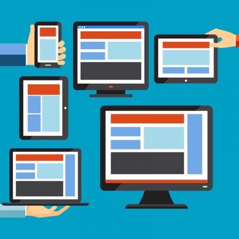
Optimising each page for different devices
Whilst this is often all well and good for people browsing your website on a desktop, laptop or even larger tablet device, when viewing website pages on a mobile phone, the screen real estate space is much different - you do not have the larger screen width to work with, instead more often just the narrower width but taller height. This is where a mobile first web design strategy becomes important. It is no longer ideal to just create each website page section for desktop, and live with how that flows when viewed on mobile. Instead, each section of a web page needs to be adjusted for each device type to make sure that the most is made of each.
Using the example above, where each Service has its own section of a page, with images alternated right/left/right/left, nearly all web designs would present this strangely on mobile, making it flow:
- Text
- Image
- Image
- Text
- Text
- Image
- Image
- Text
As you can see above, this leaves sets of two images or text blocks flowing one above the other, which can look a little unusual and perhaps unclear as to which image is supposed to be with which block of text. With mobile phone browsing well above that of desktop use nowadays, we would use our web design tools to specifically affect the mobile view of this page to instead flow more sensibly as:
- Image
- Text
- Image
- Text
- Image
- Text
- Image
- Text
This gives a significantly clearer layout for mobile visitors, with a standard layout for each service as they scroll down the page. No guessing about images, no strange pairs of image or text areas.
We will be going over our approach to the 'Mobile First' design strategy in a later article, but for now hope that you now have a bit more understanding of what a website page actually is, and also how we look at the design of each, making sure your whole website follows a standardised layout that makes things optimised for visitors, customers and also the type of device they are using to browse.
If you'd like any more information about our service, please don't hesitate to get in touch, we'd love to hear from you:
When you subscribe to the blog, we will send you an e-mail when there are new updates on the site so you wouldn't miss them.


Comments